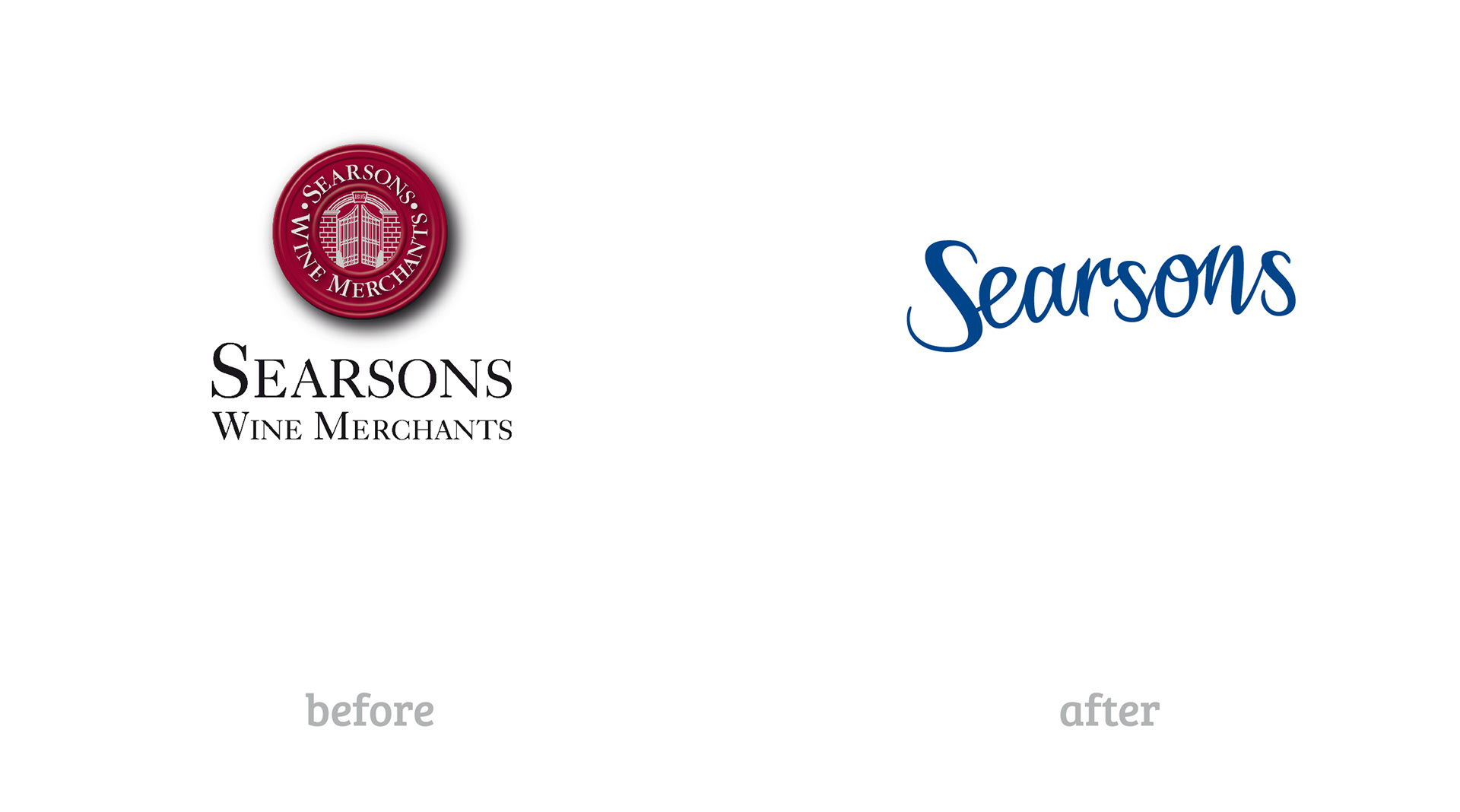
Searsons Wine Merchants were changing their business model by taking all sales transactions online, reconfiguring their ordering and delivery systems and targeting a younger customer base. A new visual identity was required to include the new customer and to indicate that a revolution was happening.

While the burgundy 'seal' was disappearing as the main icon, we thought the seal could have tactical uses as a descriptor and a call to action. The illustration, typography and colour palette was given an overhaul.
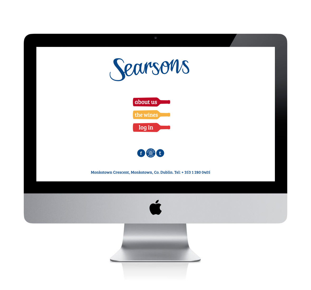
The website was crucial in visually conveying the ease of use and simplicity of the new ordering system. Lots of white space and as little clutter as possible. www.searsons.com
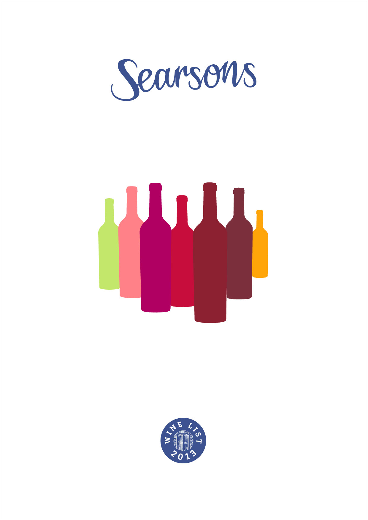
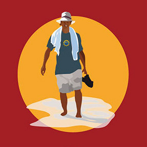
The printed wine list needed to fit with the new guidelines and visual language - so out with the stock photography.